Case Studies
LocalChow App Case Study
A look at the design process for a local grocery ordering app from conceptualization to completion.

Our problem was that users wanted to shop locally, but found that they didn’t have the time to travel to multiple shops to search for specific ingredients. Therefore our goal became to design an app that allows users to order groceries for delivery from several local, independent grocery stores simultaneously.
For this project I was the sole UX designer, researcher, and writer. My responsibilities included planning and conducting interviews, paper and digital wireframing, developing high-fidelity mockups, low and high-fidelity prototyping, designing and conducting usability studies, prioritizing accessibility, and iterating on designs.
Understanding the user
User research
Personas
Problem statements
User journey maps
User research
After conducting interviews, I created personas and empathy maps to better empathize with prospective users. We identified our primary user group as working adults who cook more than three times per week. While this user group was invested in finding diverse ingredients quickly, research revealed that they were also motivated by local discount options, reward programs, and the community benefits of shopping locally.
User pain points included:
Time. Working adults are too busy to travel to multiple stores to find a single ingredient.
Convenience. Independent grocery stores cannot compete with the large inventory and individual delivery systems of large chains.
Cost. Smaller retailers often cannot compete with rewards programs or discounts offered by large chains.
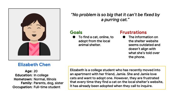
Personas
To facilitate empathizing with users, I created two personas.


User Journey Maps
Mapping Robert’s user journey revealed how helpful it would be for users to have access to a grocery ordering app that included multiple shops.

Starting the design
Paper wireframes
Digital wireframes
Low-fidelity prototype
Usability studies
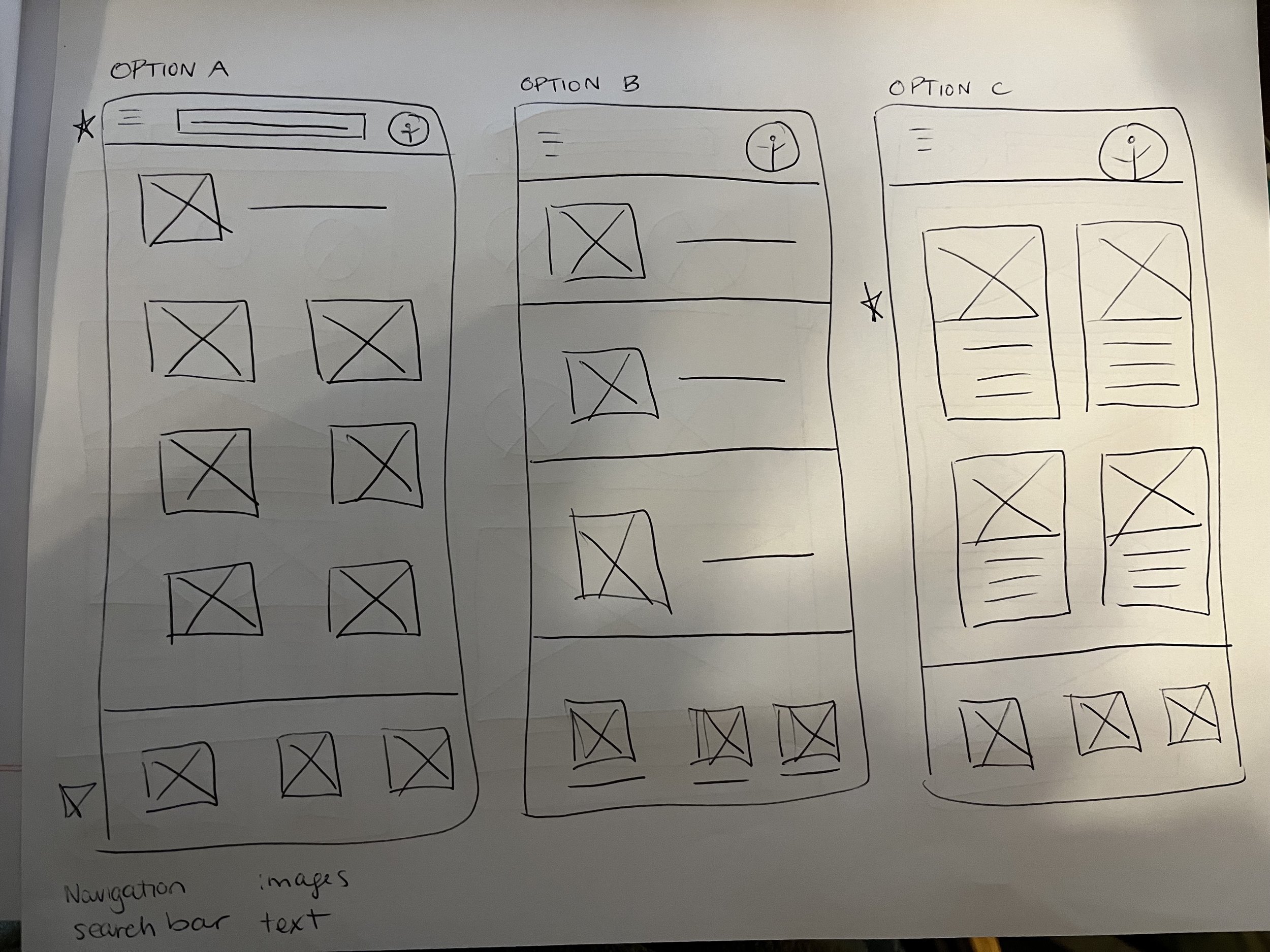
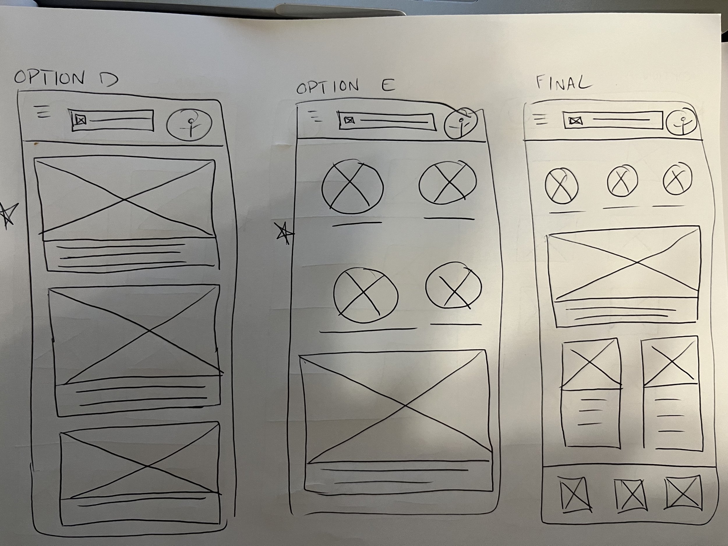
Paper wireframes
I began by drafting iterations of each screen on paper to quickly understand which design elements would be best-suited to address user pain points. For the home screen, I prioritized strong visuals to showcase the diversity of available ingredients.
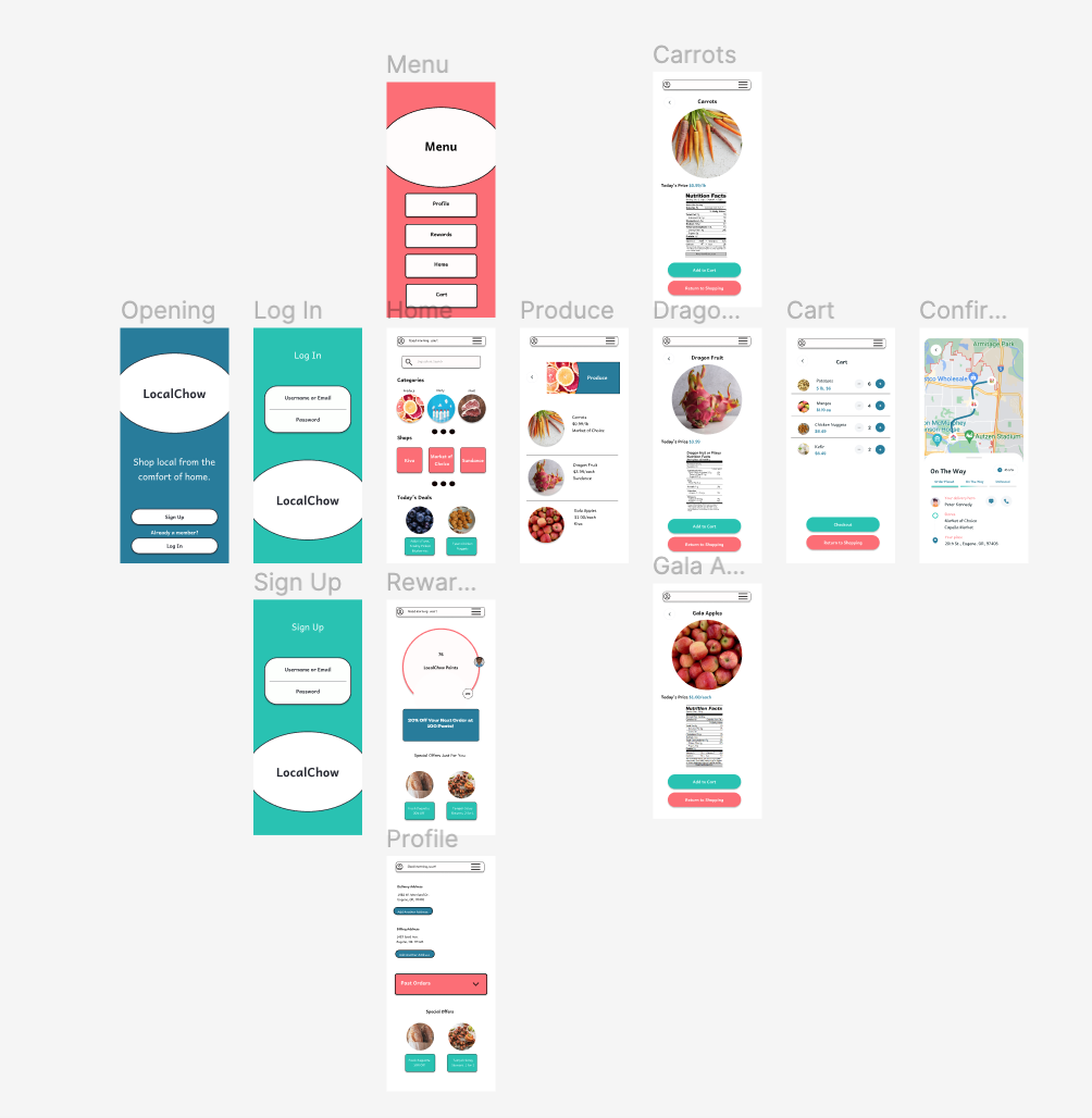
Digital Wireframes


Low-Fidelity Prototype
The low-fidelity prototype connected the primary user flow of selecting and ordering groceries, so the prototype could be used in a usability study with users.
View the LocalChow low-fidelity prototype.

Usability Study: Findings
I conducted two rounds of usability studies. Findings from the first study were used to shape the mockups, while those from the second study offered insights into which elements of the mockups deserved further attention.
Round 1 Findings
Users need expanded search options.
Users want additional routes to access an expanded menu.
Users want to be able to find and use deals quickly and earn loyalty rewards.
Round 2 Findings
Buttons should be more visually conspicuous.
Users would like to see nutritional information easily.
Refining the Design
Mockups
High-fidelity prototype
Accessibility
Mockups


High-fidelity prototype
The final high-fidelity prototype offered a clean user flow, smoother navigation, and a more accessible color scheme. It also met user needs for discount integration and multi-store search and order.
Explore the LocalChow High-Fidelity Prototype.
Accessibility considerations
To better support accessibility, I:
Used icons to help make navigation easier.
Selected an accessible color palette and appropriately paced animations to support visual processing.
Provided access to users who are vision impaired through adding alt text to images for screen readers.
Going Forward
Takeaways
Next steps
Takeaways
The app has significant local impact as it encourages busy working users to continue to support their favorite local, independent grocers. One user from the second usability study exclaimed: “I haven’t shopped locally since I discovered the convenience of online grocery ordering two years ago. Now I can FINALLY support the local economy again!”
While designing the LocalChow app, I learned that user needs will often take your design in new, wonderful directions. Integrating feedback at multiple stages of the design process led to the creation of a richer, more robust user experience.
Next Steps
The next steps in this process would be to conduct an additional round of usability testing to ascertain if all pain points have been effectively addressed. I would also conduct more user research to determine new areas of need.